


Mount Pleasant Village BIA (Business Improvement Association) is a non-profit organization located at Mount pleasant between Eglington and Davisville in Midtown Toronto. The organization aims to make the shopping experience better for the local community. Currently, their website was developed without the user's behavior and needs in mind. The client wanted to learn how can they make their website more user-friendly by tackling the user pain points like :
Client Case Study
-
How can we enhance the user experience of visitors to the website?
-
How do visitors search for potential services, and have they been successful in their search?
-
What information are the visitors looking for on an informational website like Mount Pleasant Village?
-
What are the common pain points shared by users and how may we address them?
To understand the current experience of the users with the website through user research methods. As a result, the content strategy and layout of the website played a major role in information seeking to achieve the required user goals. By mapping the user's experiences along with the business opportunities, we were able to address the pain points that are critical to even the business with limited resources and budget. Our solution has been reflected through a Business Canvas model, Value Proposition model and Experience maps where we empathize with the users and the client's business values & goals.
Our Approach
Keywords
Experience maps. Business Canvas Model. Value Proposition Model. Prototyping. Usability Testing. Information Architecture. Competitor research. Semi-structured interviews. Card Sorting. Google Analytics.
Team
6 Team members
Timeline
Jan'22 - April'22
Tools
Miro, Figma &
Optimal Workshop
Platform
Mobile App
What do they do?
01
Support local businesses through resources, improvements
02
Aim to enhance the shopping experience for visitors
03
Host community events, marketing, government lobbying and build the area's infrastructure

Source: Twitter/ Mt_Pleasant_BIA
What were the concerns?
01
Limited resources and budget as a non-profit organization
02
Users' complaints on not being able to seek information.
03
Unaware of user's needs, behavior and interaction with the website


What was our approach?
Client
Kick-off
Meeting
User Research
(Round 1)
Current Experience mapping
Brainstorming
Prototyping
User Research
(Round 2)
Envisioned experience mapping
Round 1
Competitor Research
Surveys
Semi-structured Interviews
Usability tests
Google Analytics
Round 2
Usability tests
Card sorting
In Round 1 we conducted a triangulation of methods, to confirm / contradict our presumptions on user behavior.
Competitor research: To learn the content strategy across other BIA informational websites.
Surveys: To learn how visitors shop around Mount Pleasant Village through their shopping habits and preferences.
Semistructured interviews + Usability tests: To learn that users had limited access to information and struggled with information findability.
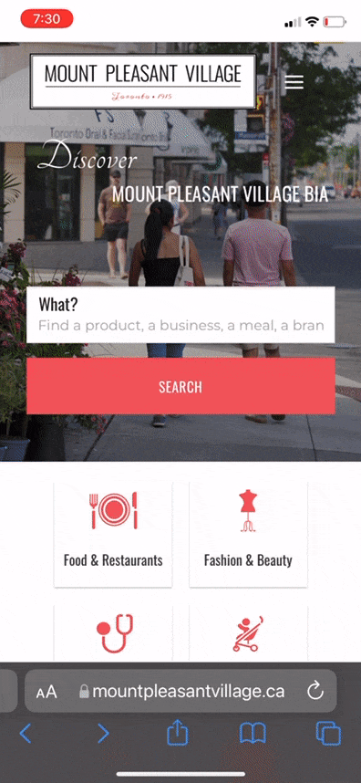
Google Analytics: To learn that mobile was the preferred mode of access
In Round 2 we conducted the usability tests on the prototypes based on the feedback on the first round, followed by a card sorting technique to redesign the information architecture of the website. As a result, we created a sitemap of the new categories for the shops and services and documented and updated the changes on the design
Client Kick-off Meeting
Why
To understand the business value, mission, customer relationships & cultural knowledge of the organization, as a result we created a
- Business canvas model &
- Value map proposition model
Documenting the organizational knowledge promoted a common understanding among the stakeholders and the design team.
Business Canvas Model
(Outcome)

Meet Julie Donahue
Users like Julie Donahue
>50%
Toronto
of users were from
Visitors
2.9k
Used mobile version
49.8%
Seconds
Avg. time on homepage
Homepage &
Search directory
Frequently visited pages
11
2.9k
Avg. user retention
out of which 207 are returning users
51
Avg. time on search
Seconds

Leaside, Toronto
Mother of two children
Loves to plan ahead of time shopping
GOALS
Being aware of event-based sales
Staying connected with the community
Julie's Journey
We mapped our persona's journey to determine the pain points to then determine the strategies that the organization can implement in order to eliminate the pain points encountered by the user. This helped us in visually presenting the client ,the current journey of their users.

Pain Points

Unclear purpose the website

Difficult Navigation

Confusing Search & Filter

Scattered content information
Addressing the Pain Points
Service Integration

Envisioned Julie's experience map

Storyboard
Scenario 1
Julie, a busy mother, can see current
promotions on their favorite store without needing to search for it
Storyboard
Scenario 2
Julie, a curious shopper, can find all the event-based deals and store promotions in one place
We envisioned our persona's journey to reflect on how the journey would entail with the implemented new suggested design solution. By even running an A.B testing of two different versions of the designs, users chose the second version in the search filter application. As a result, the organizations( client/ stakeholders) decided to go with our prioritized list of features based on the resource and time allocation on implementing the high priority recommendations that were critical to user behavior.
Our Learnings
We WONT get it right the first time
Triangulation of research methods replaces assumptions
With limited time and budget, choose effective & efficient ways of
research methodologies
Clientele availability/limitations in budget & resources should be aligned
with recommendations on various levels of priority